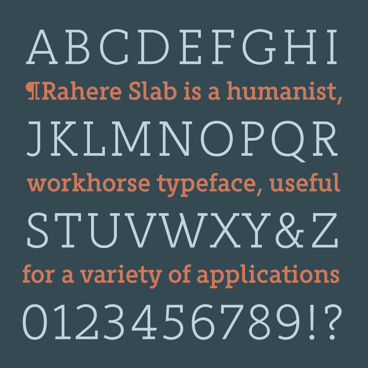
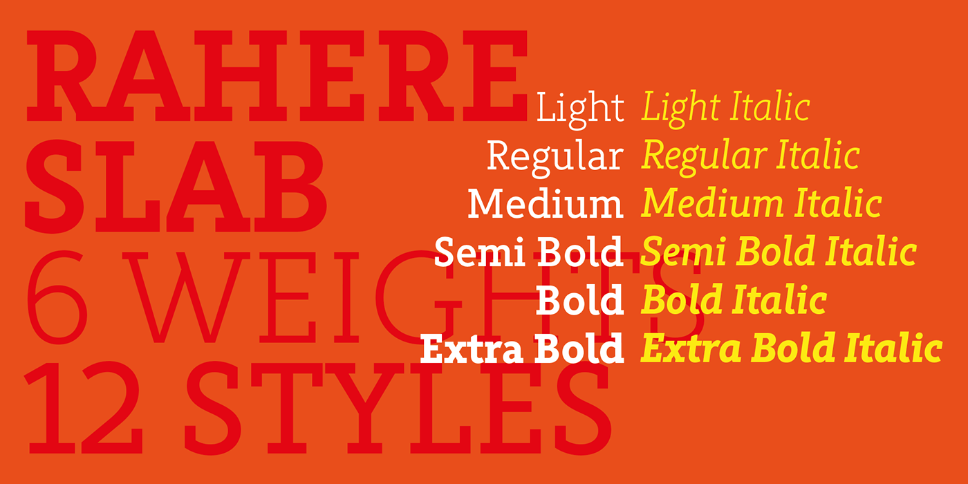
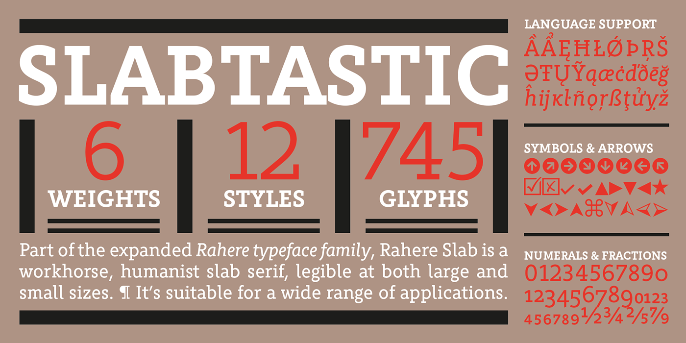
Part of the extended Rahere typeface family, Rahere Slab is a humanist slab serif in six weights from light to extra bold with corresponding italics.
Like its sibling Rahere Sans, Rahere Slab features subtle detailing, giving the typeface a distinctive, warm appearance without distracting the reader. Legible at large and small sizes, it's a versatile, workhorse typeface suitable for a wide range of applications such as information signage, packaging, annual reports, advertising, brochures, catalogues, screen text and visual identities. For projects that need to convey a sense of authority tempered with diplomacy, or if the message just needs some serious oomph, this is a great slab serif for the job.


The italic lowercase is more cursive and calligraphic than the roman, but it harmonises perfectly, displaying enough character to create emphasis without looking out of place. When used on its own (for example, pull-out quotes), the italic exudes a charm that draws attention to the text.


